|
A property is simply a Configurator choice. Each Product Line will have its own Product Configurator setup. Begin by determining which properties or choices apply to each product line. Sort the order in which you place the properties according to the most logical sequence that a customer would use to place an order for that product.
If a particular property has a common chosen value you can set a default for that property. If the property does not have a commonly selected value, leave the default field blank. (e.g. Since the diameter of the table can be a range of values we will leave the default blank; however, if the Height of Table is usually 28" we could insert that value as a default.)
|
|
|
Property:
|
The name of the property
|
Caption:
|
Used to supply a friendly cursor hint for users when the leave the cursor over a property
|
Product Line Default:
|
When the product line is loaded, it can be pre-loaded with default values.
For Regular and Item Lookup Combo Box property types, select a value to have it load by default. For Text Box properties, type in the value or text you wish to load into the text box by default.
|
Position:
|
Controls the sort order of the properties. Start by using increments of 10 to leave room for future properties to be inserted.
|
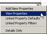
By clicking the right mouse on the property line item an additional menu is displayed as shown above.
Select New or View Properties to display the following form. If you would like to add a new property, click Add.
Properties Form Field Reference
|
|
|
Property:
|
Name of the property
|
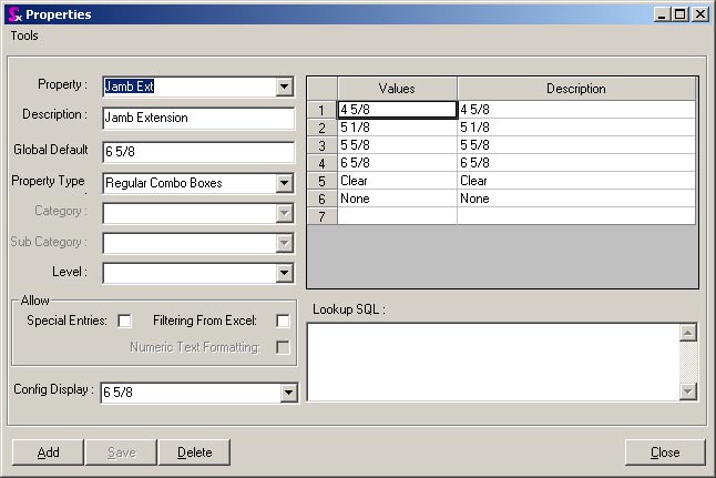
Description:
|
Description of the property
|
Property Type:
|
Text Box: User enters text that is not a drop down list. This is typically used where the user enters a dimension or size for example the width of a table.
|
Regular Combo: - The Configurator this will display the selections listed in the property values and description section. These are choices that you do not want set-up as items in the item master.
|
Item Lookup Combo: This will display a drop down list of items set-up up in the item master. It will be filtered to the category and sub categories selected. Example on a vehicle - choose from a set of available tire item numbers. If the category selected is Tires the Configurator will display all items in the item master that have a category of Tires.
|
Line: Draws a horizontal line across the configurator form. Used for organizing properties into logical groups.
|
Gap: Special use only. Contact Seradex for assistance with this feature.
|
Allow Special:
|
If Allow Special is clicked the user will be able to input a choice that is not contained on the Value List. Example: Size. Common flag sizes are 12 x 24 and 18 x 36; however customers can order a custom flag in any size. So the drop down would display common sizes but the user could enter 11.5 x 28.6.
|
Level:
|
|
Config Display:
|
|
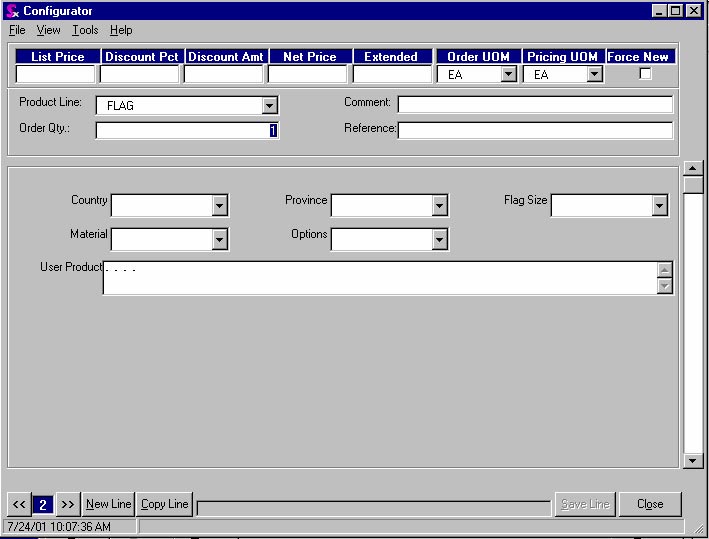
The Country, Province and Flag Size choices are regular combo properties. The material and options choices are Item combos.
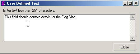
If the field properties are Text Box or Regular Combo and Allow Special, by double clicking in the field, the form shown below displays and allows the user to enter additional descriptive text.
|


